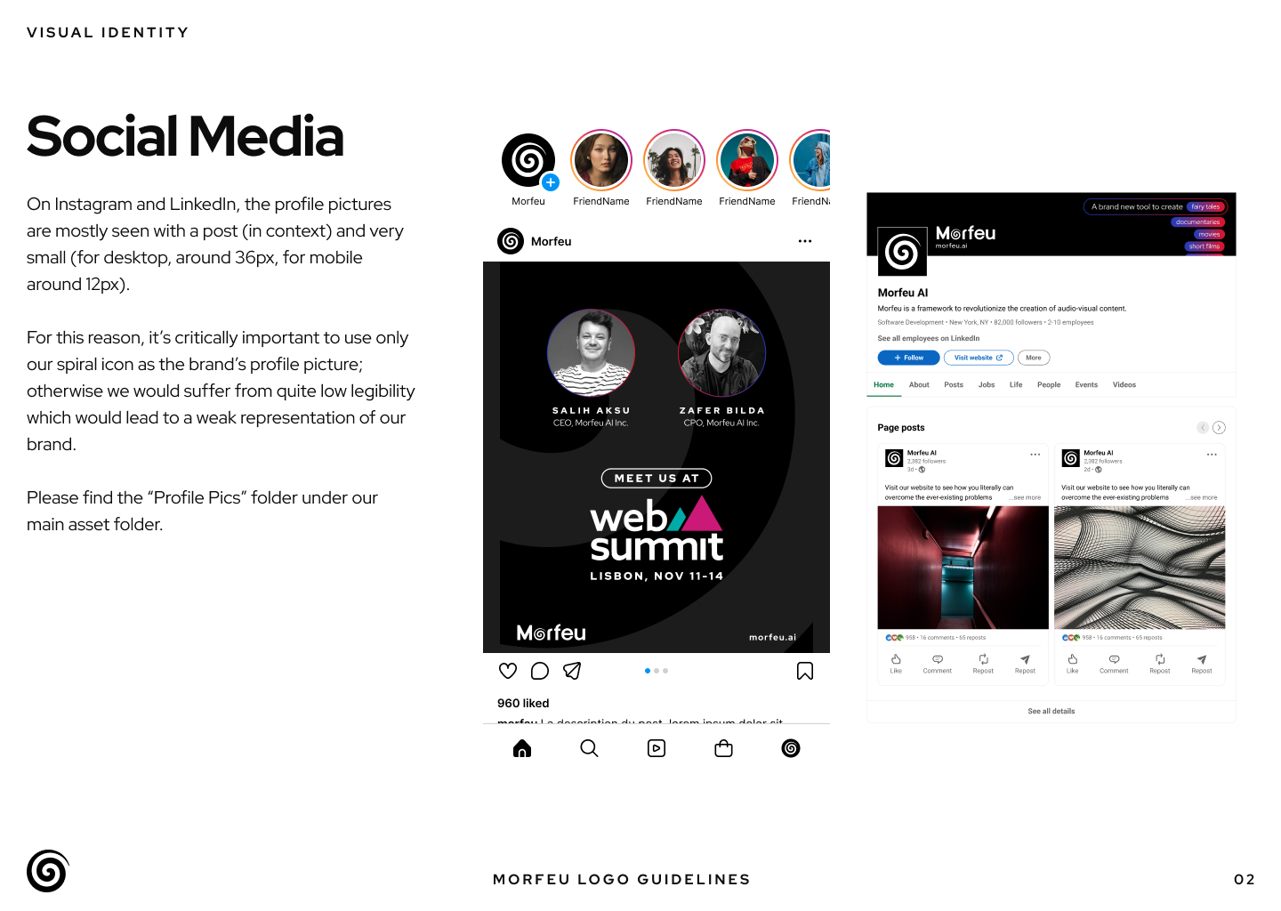
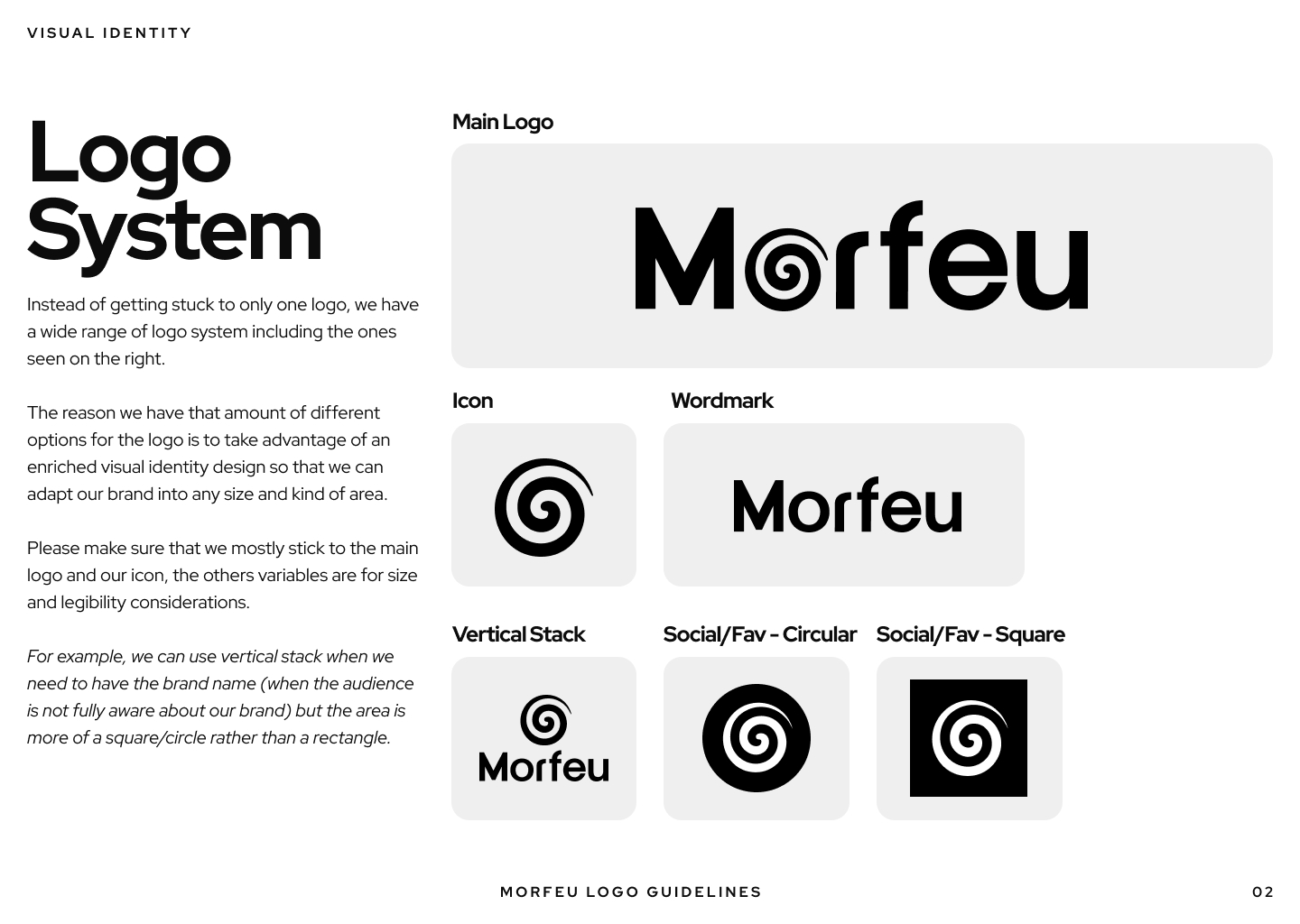
Goal
To create a refined and scalable brand identity that reflects Morfeu’s transformational nature, balances advanced AI technology with human creativity, and remains flexible across a wide range of platforms, formats, and use cases.
The identity needed to feel credible for professional and mainstream productions, while staying modular enough to adapt seamlessly to different digital environments.
Challenge
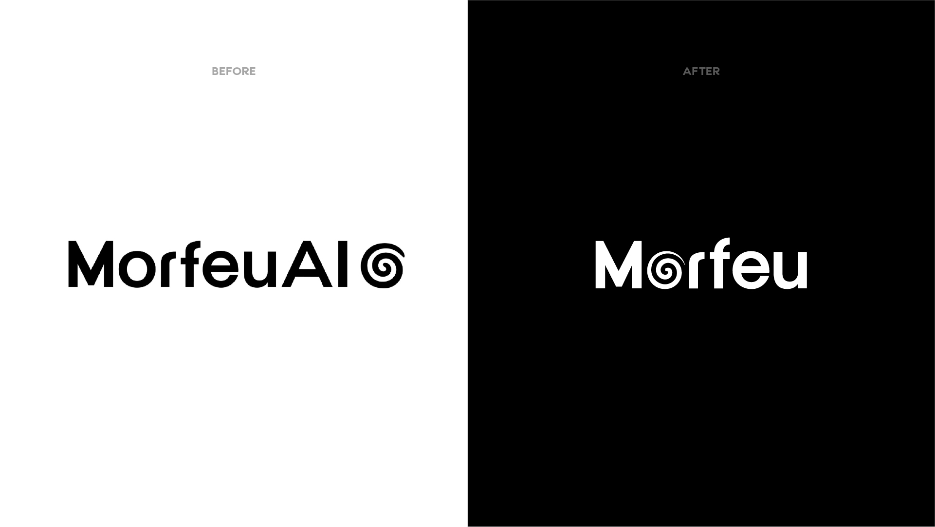
Morfeu’s existing logo featured a strong spiral symbol representing transformation, but the overall identity lacked typographic maturity and flexibility.
Key challenges included:
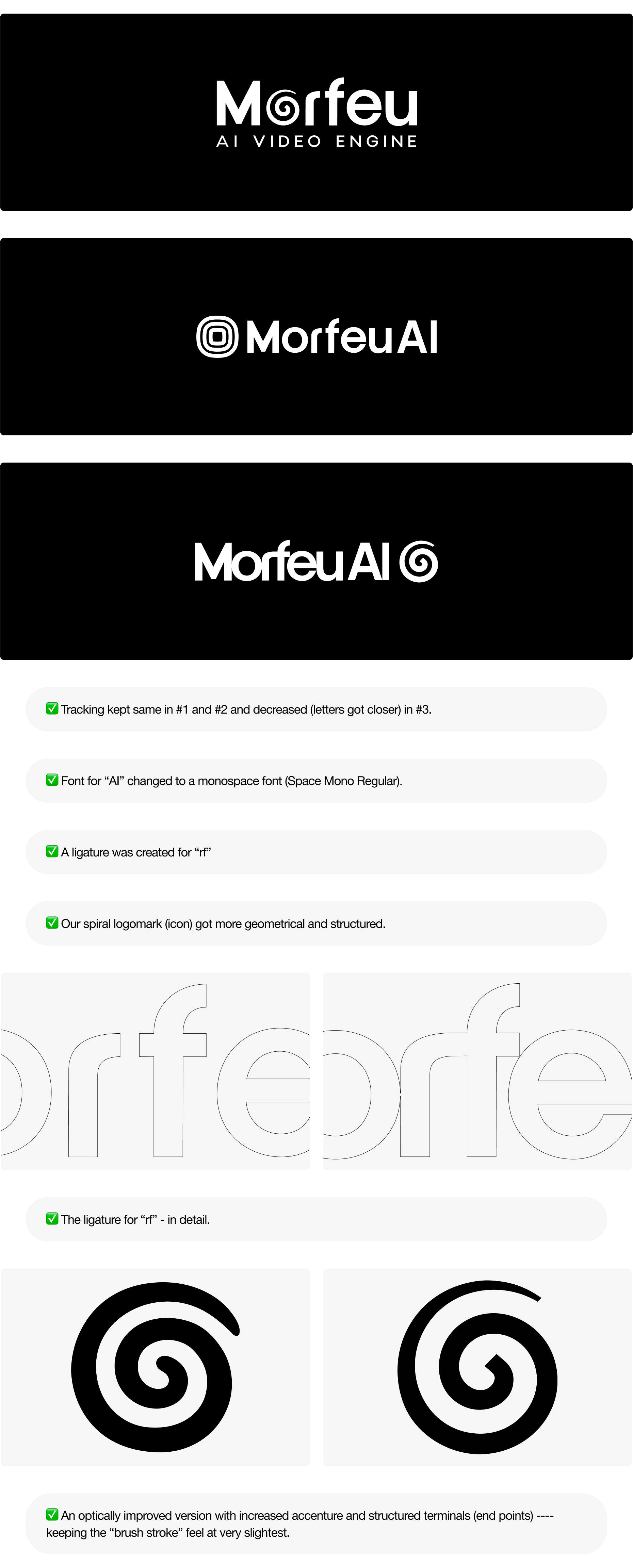
- An underdeveloped relationship between critical letterforms, particularly r–f, affecting legibility and visual rhythm
- Inconsistent kerning and weight balance across the logotype
- A symbol and wordmark that felt separated rather than integrated
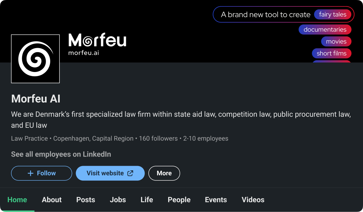
- The inclusion of the “AI” tag within the main logo, limiting scalability and long-term brand positioning
The challenge was to elevate the identity without losing its conceptual core or existing recognition.
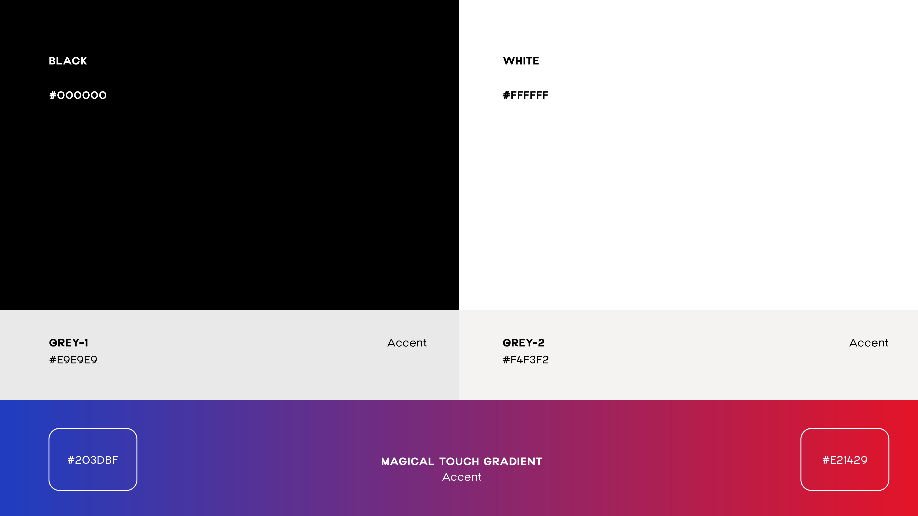
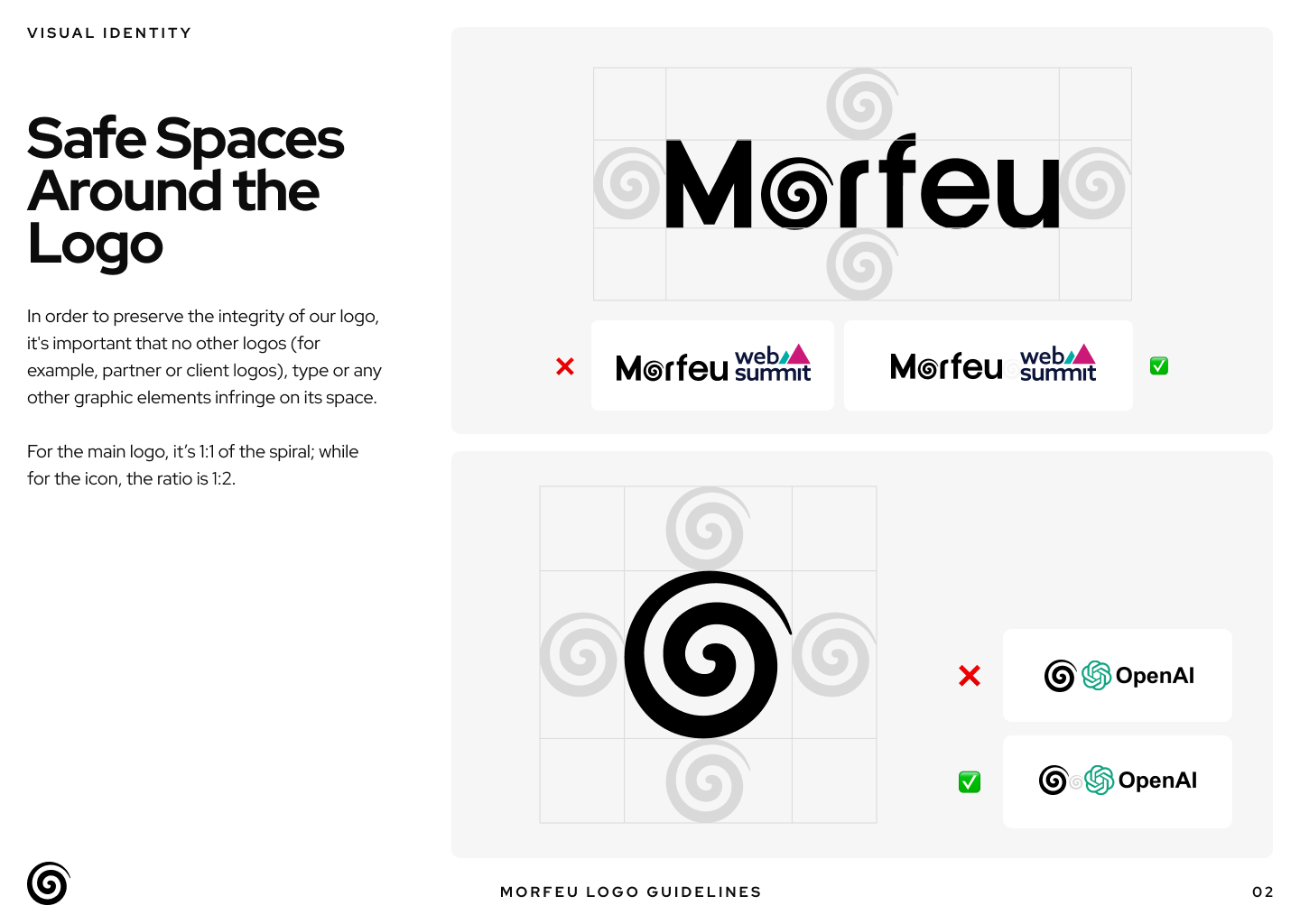
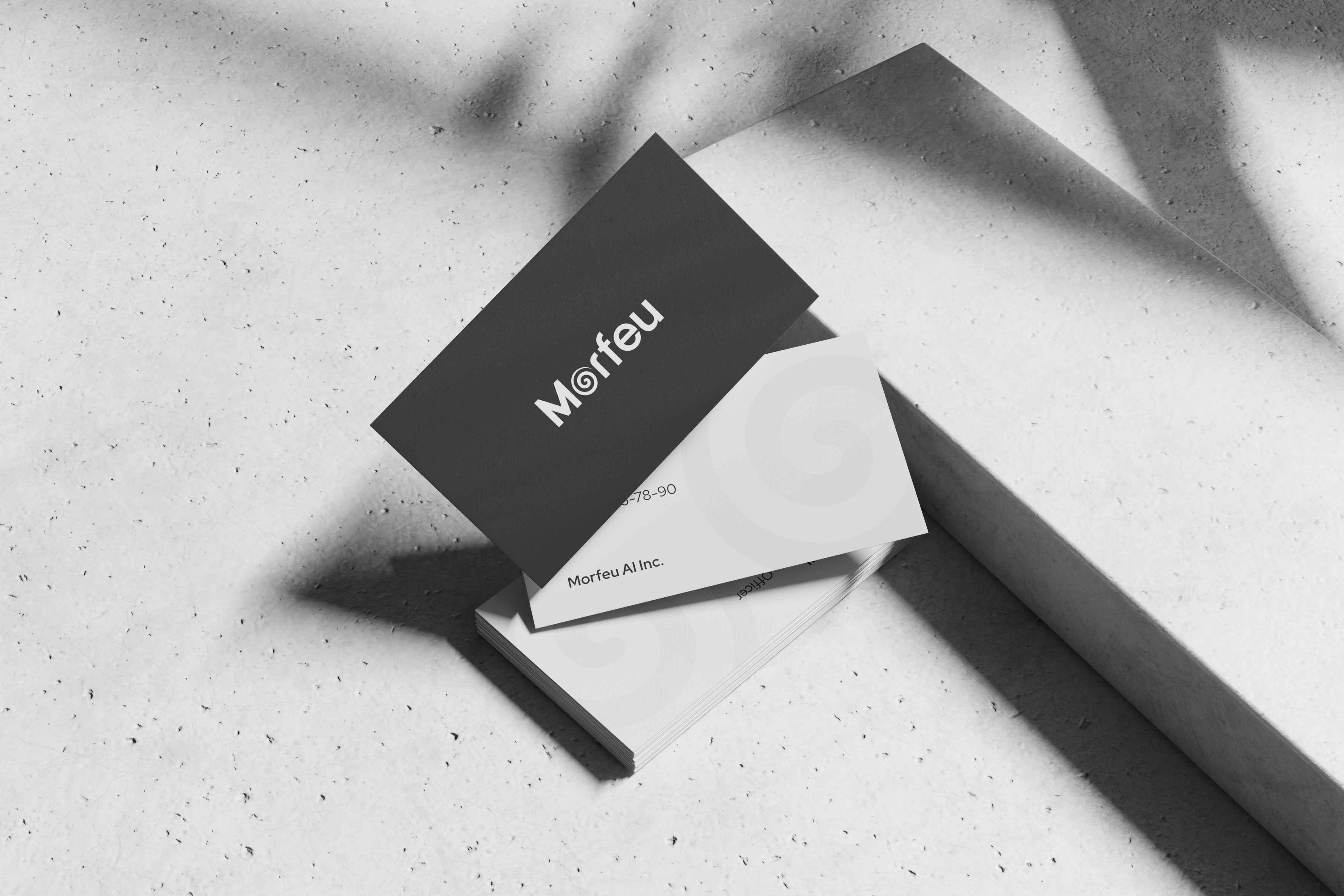
Solution
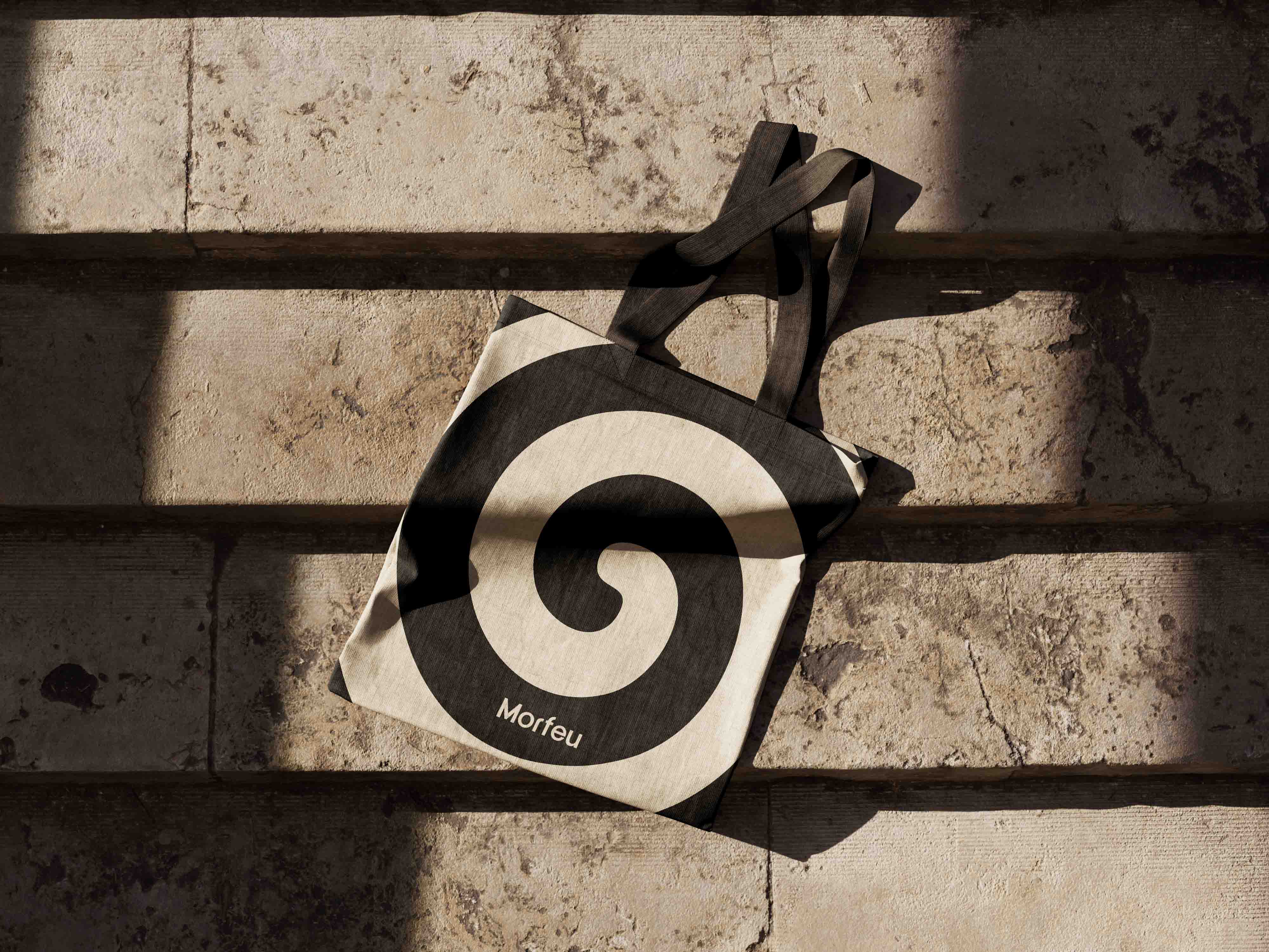
We preserved Morfeu’s spiral symbol as the central metaphor of transformation, evolution, and continuous morphing. Rather than redesigning the symbol, we redefined its role by integrating it directly into the logotype, turning the logo into a single, cohesive mark instead of a symbol–wordmark combination.
The redesign focused on a typography-led refinement:
- Improving the relationship between key letterforms, especially r–f
- Refining kerning and overall spacing for clarity and balance
- Enhancing weight distribution to achieve a more confident and professional tone
- Removing the “AI” tag from the main logo to strengthen longevity and brand focus
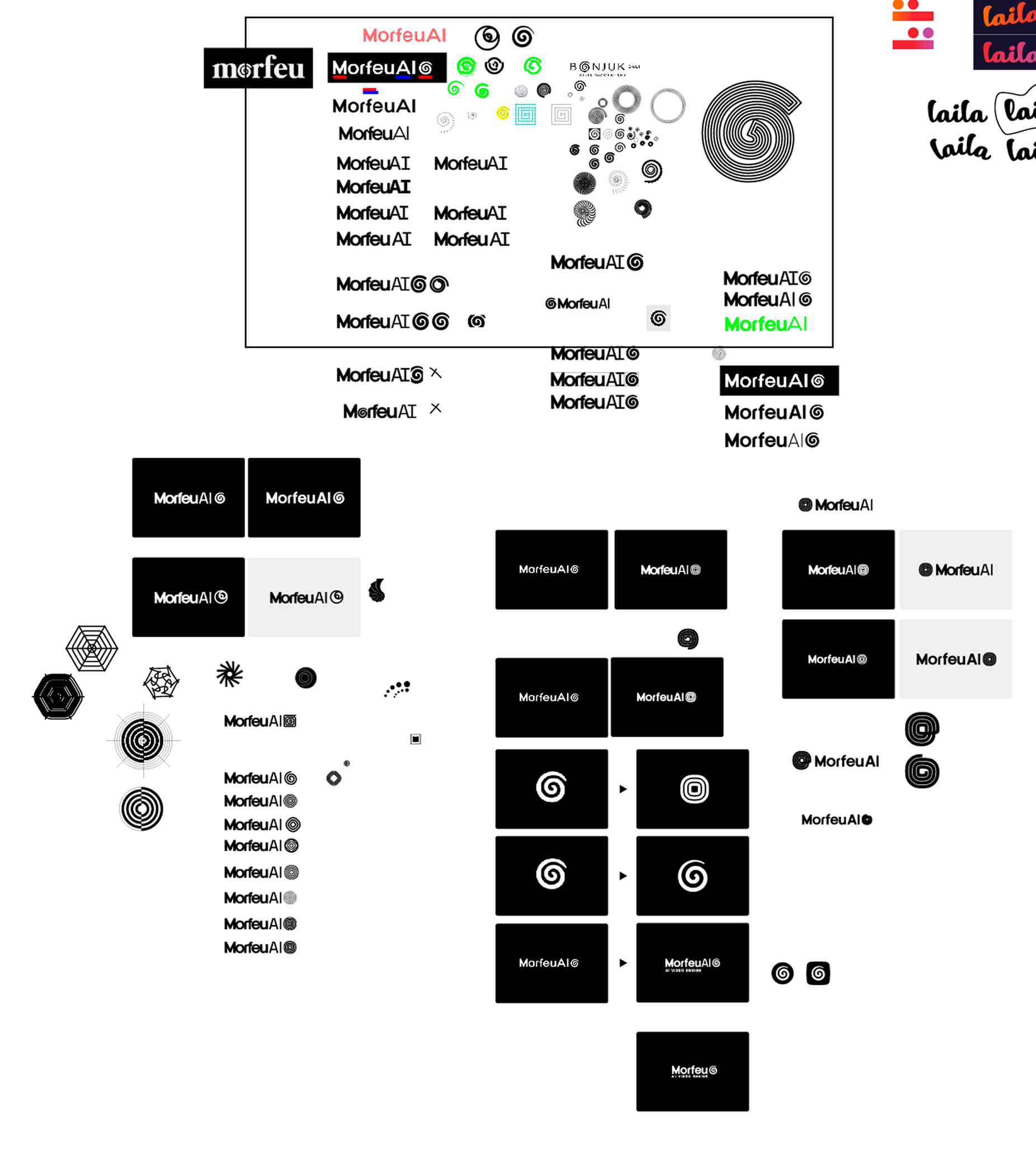
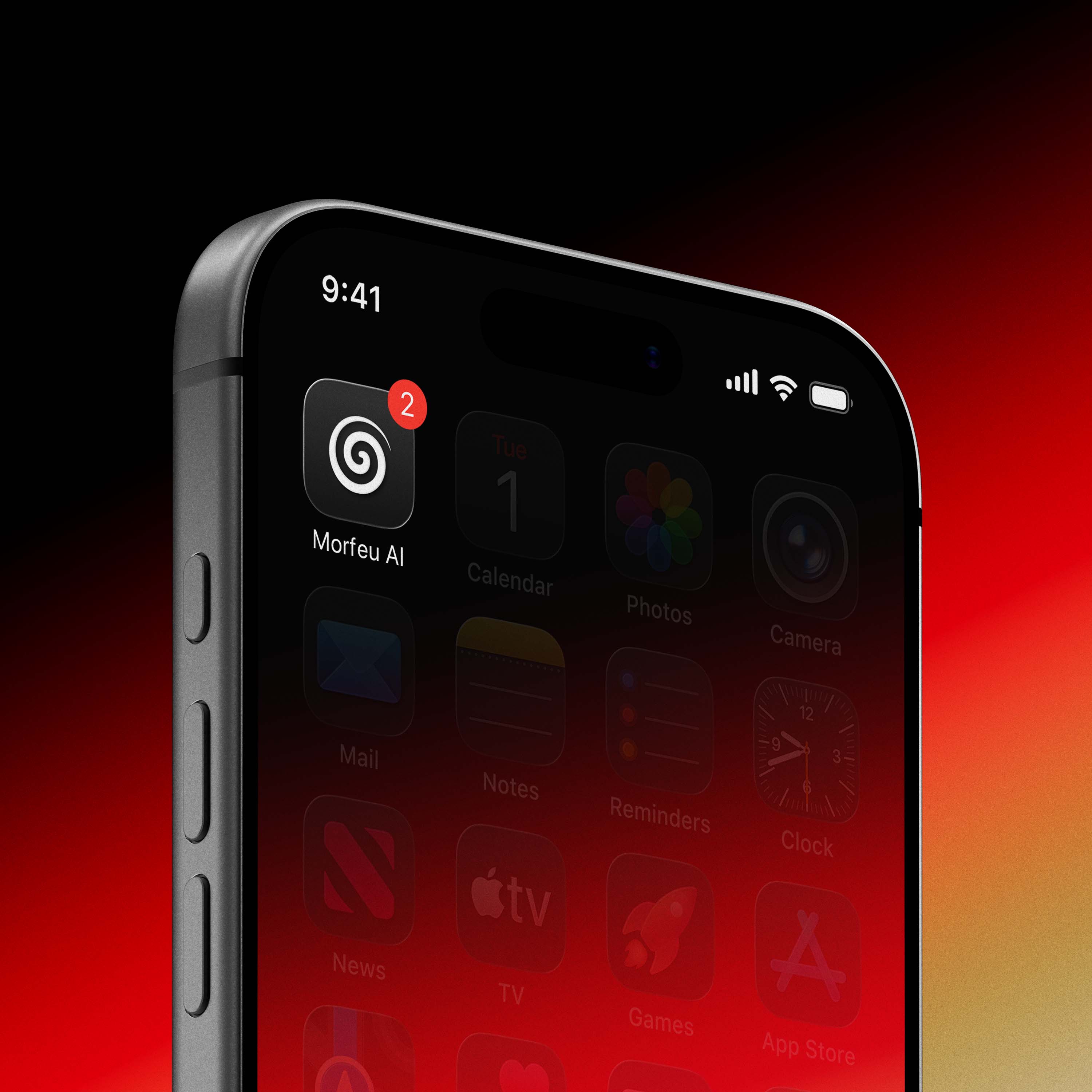
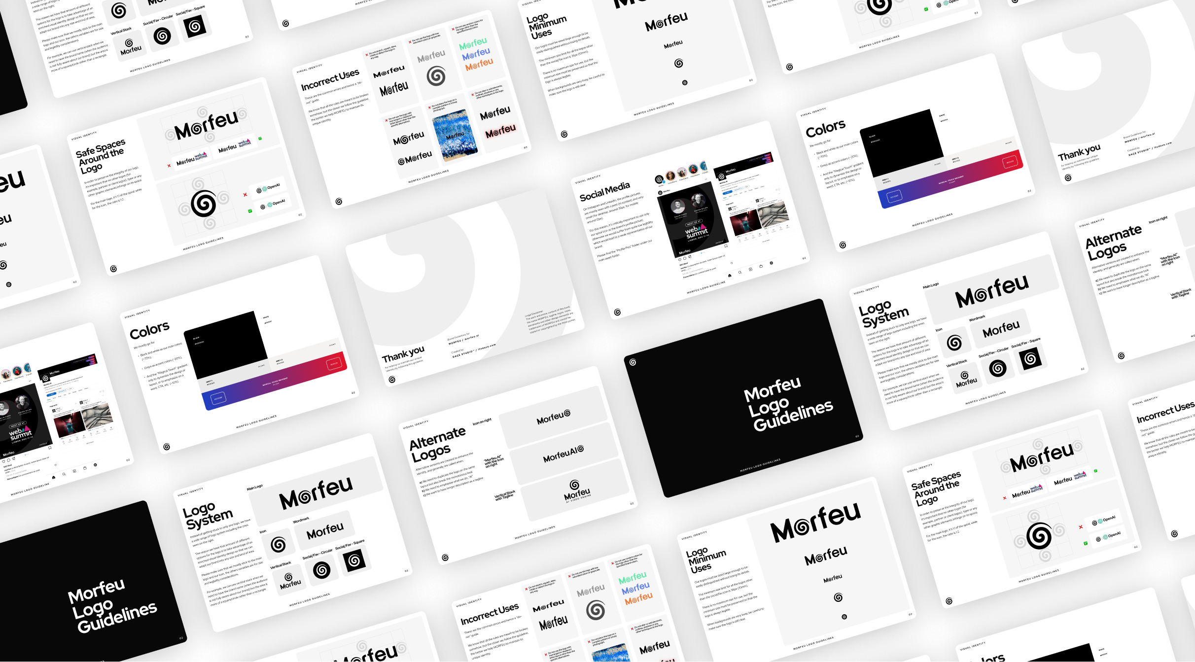
Alongside the core logo, we developed a modular and flexible logo system, including icon-only, wordmark, vertical stacks, social and favicon variants, and tagline applications. This system allows the identity to adapt effortlessly across different mediums, scales, and digital contexts.
The result is a cohesive, production-ready brand identity that supports Morfeu’s role as a platform where ideas continuously transform into visual experiences.
.gif)